Fair Earth Farms
Brand Identity, Packaging Design
Bringing compostable packaging to the produce aisle. A giant leap for sustainable agriculture, Fair Earth Farms is the first fully compostable brand of greens and salads.
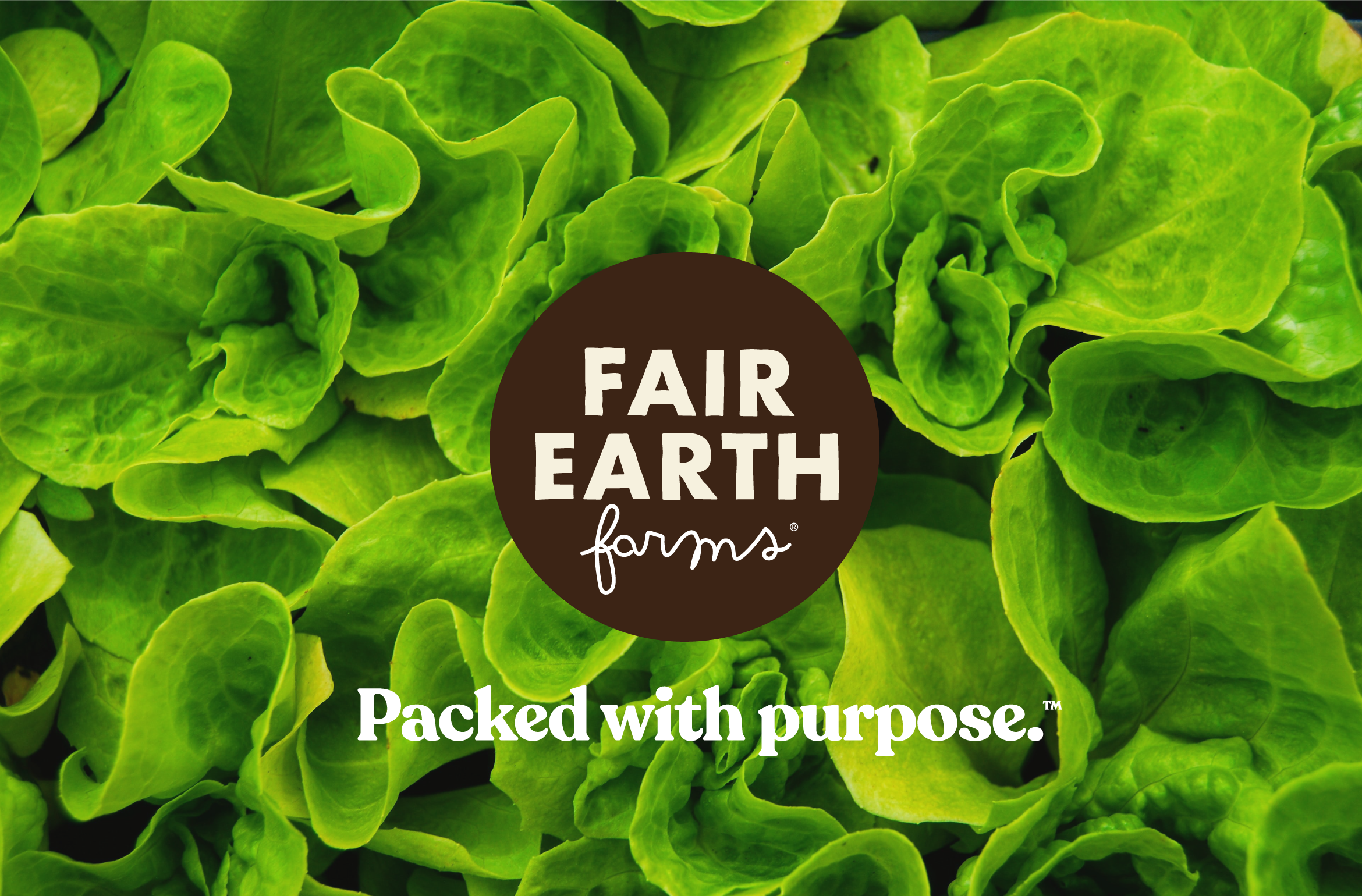
We were tasked with developing the brand strategy, identity, and packaging system for Fair Earth Farms, a company that is ushering in a new era for packaged produce.
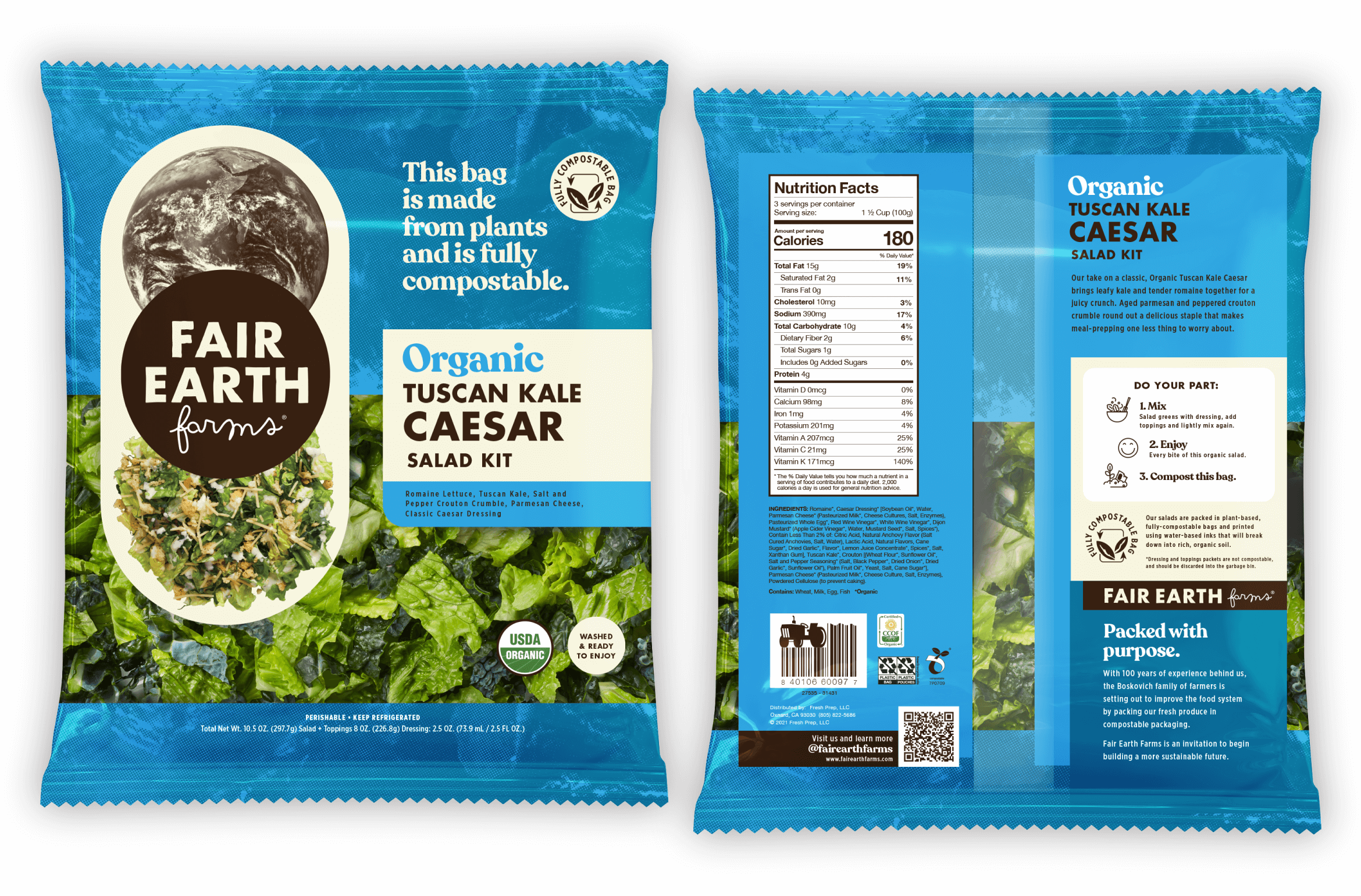
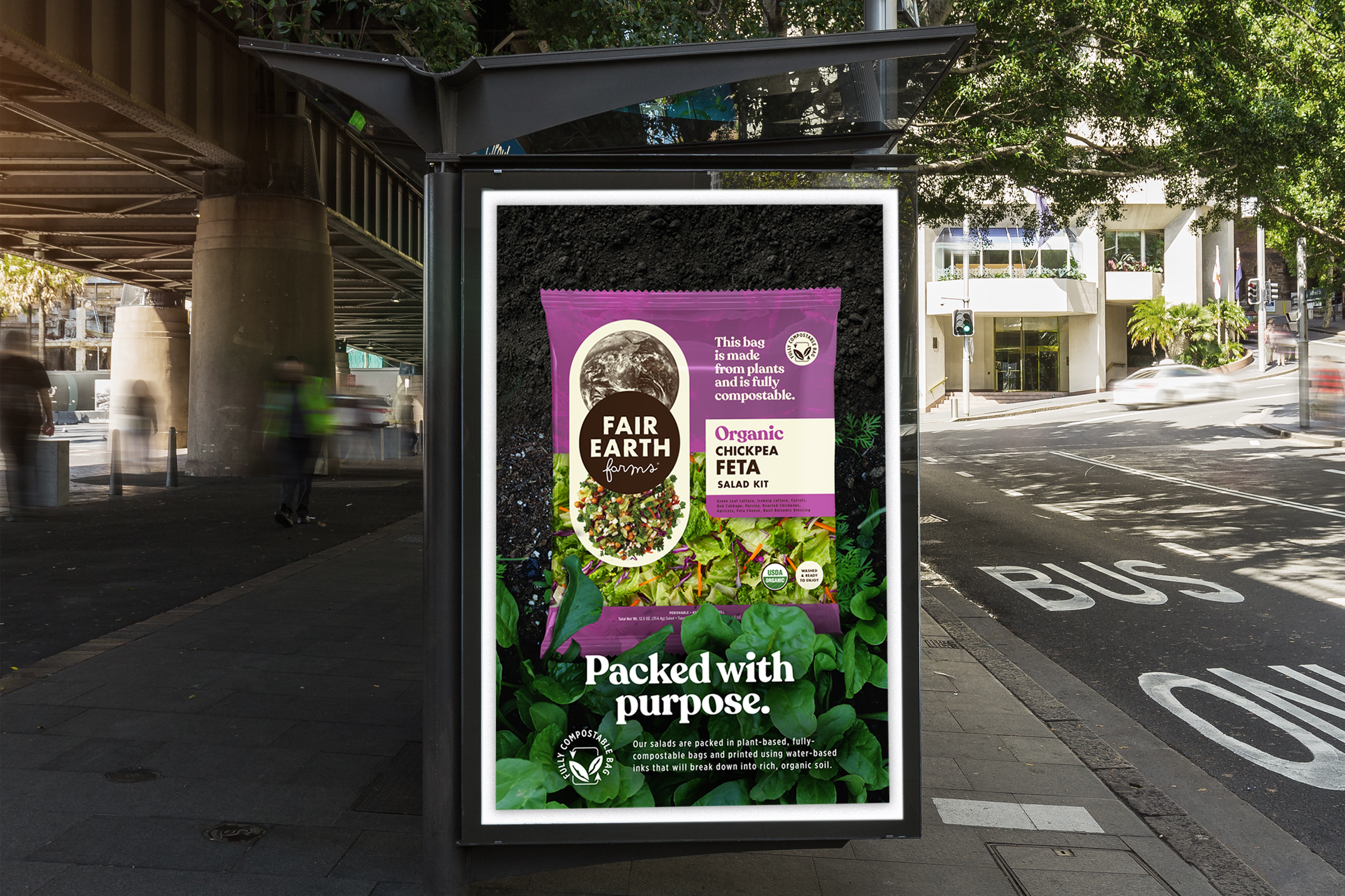
The packaging seeks to balance many aspects of Fair Earth Farms in a hierarchy that stands out on the shelf. The design signals premium, organic greens and the significant value of sustainable packaging, with points of product education along the way.
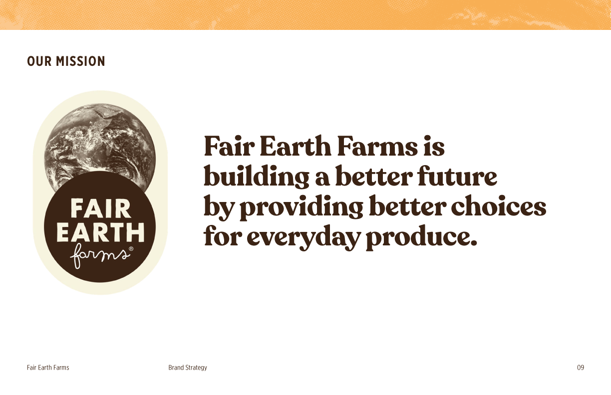
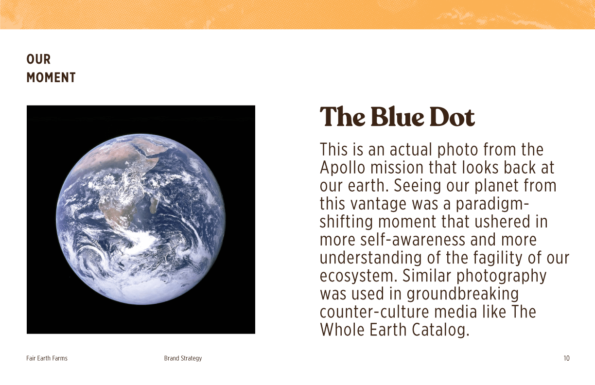
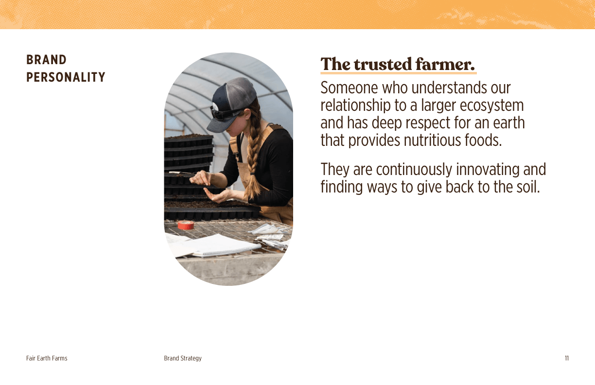
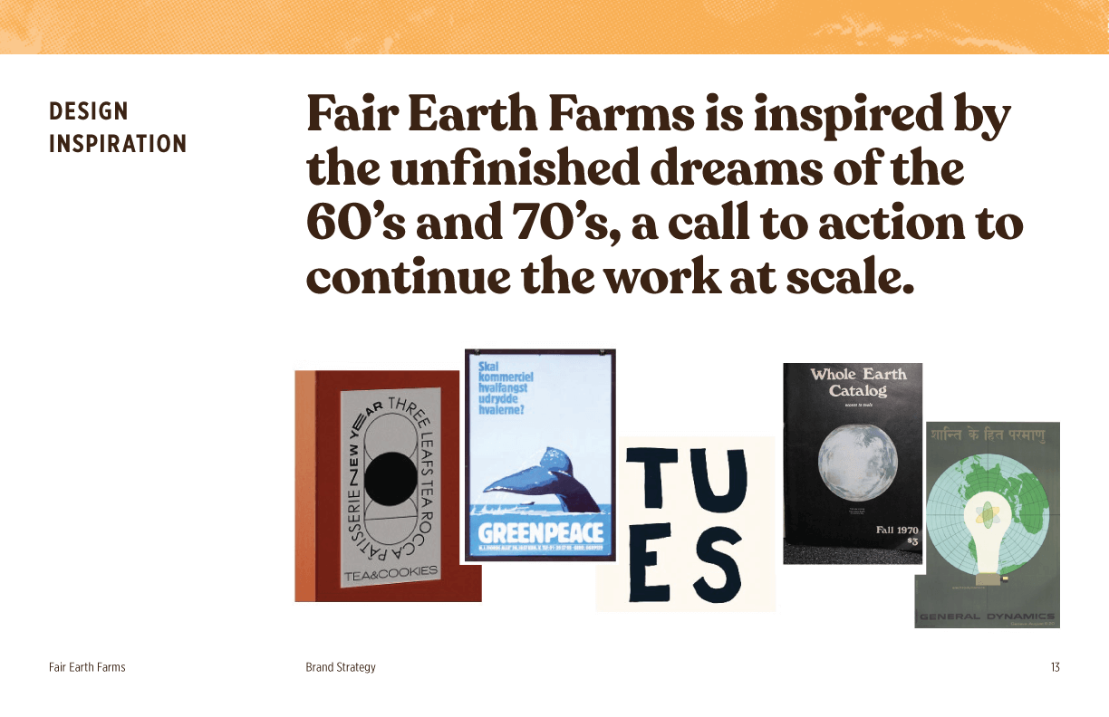
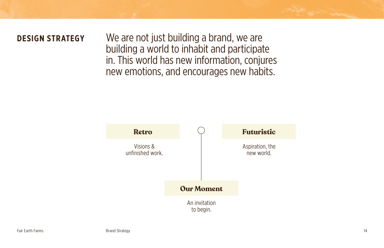
The big idea underlying Fair Earth Farms is that, through small, everyday actions over time, we can make dramatic shifts. When faced with a large scale climate disaster, it begins to answer the question: Where do I begin?
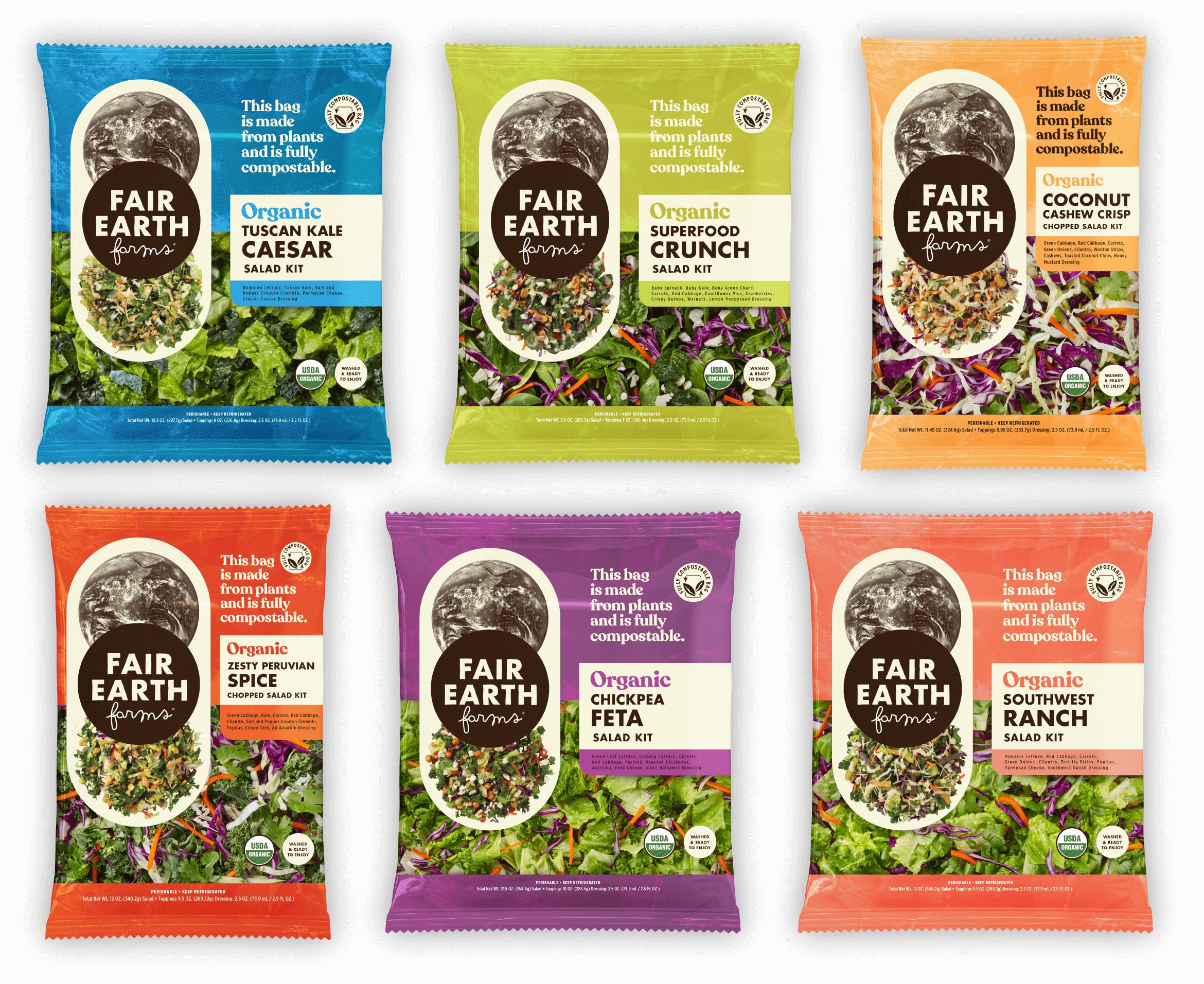
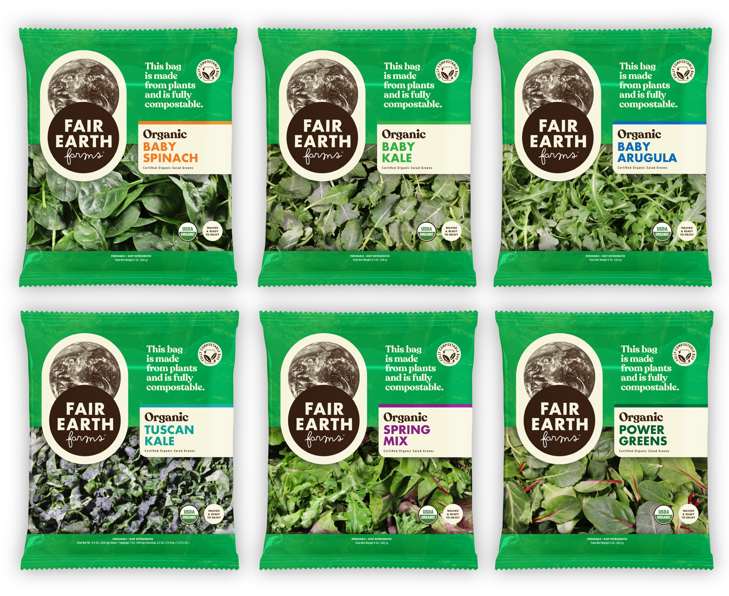
The colorful packaging system was developed to support many current and future SKUS, across different product lines. The salad kits have bright color palettes that deliver on taste and a culinary adventure, while the greens line is a powerful statement for everyday, organic produce.
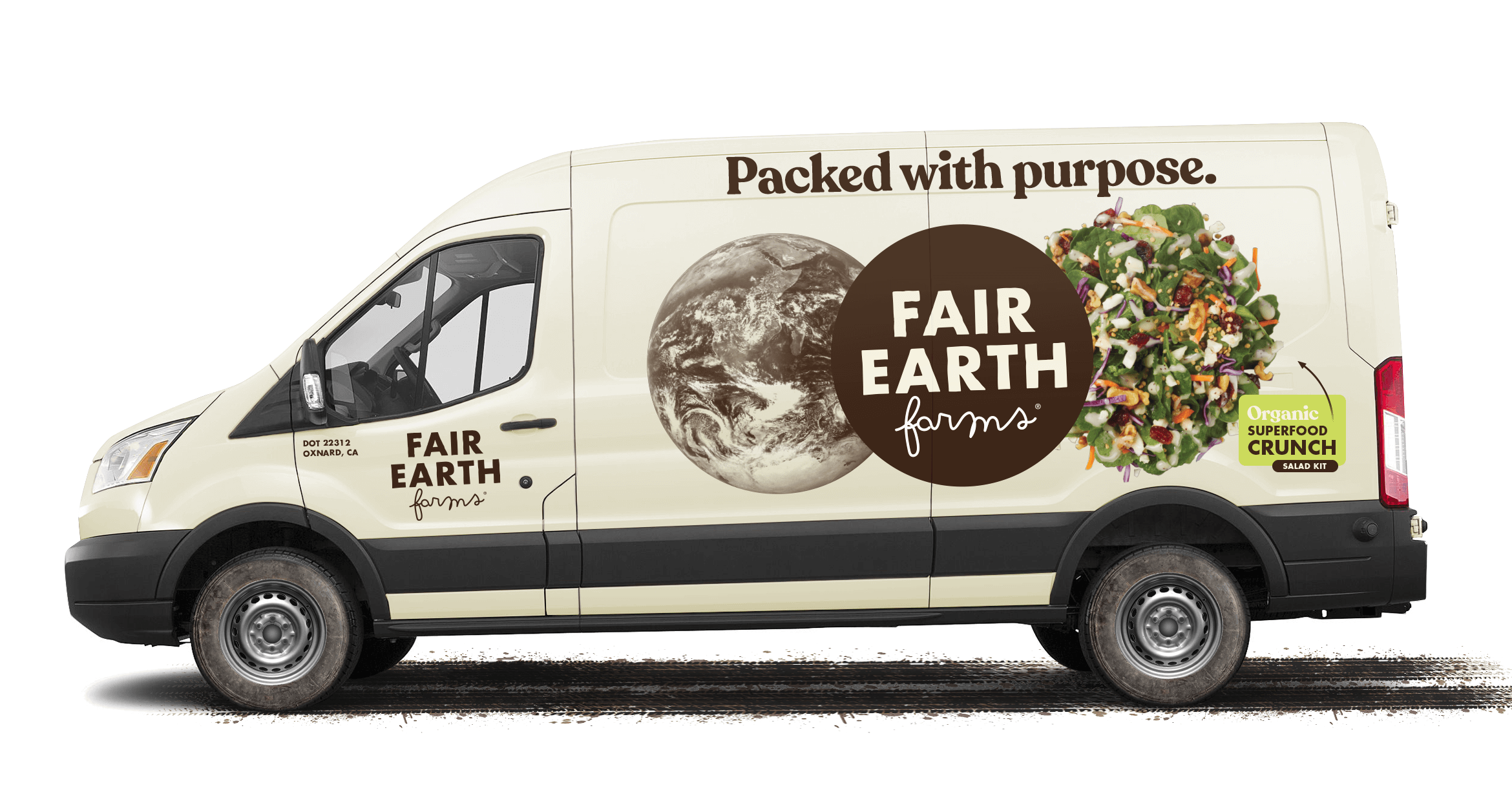
Visually, we took cues from the past and the future. Between the counter-cultural moments of the 60's and 70's that sought build a sustainable world, and the technology of the future that will help us get there, Fair Earth Farms is an invitation to begin.
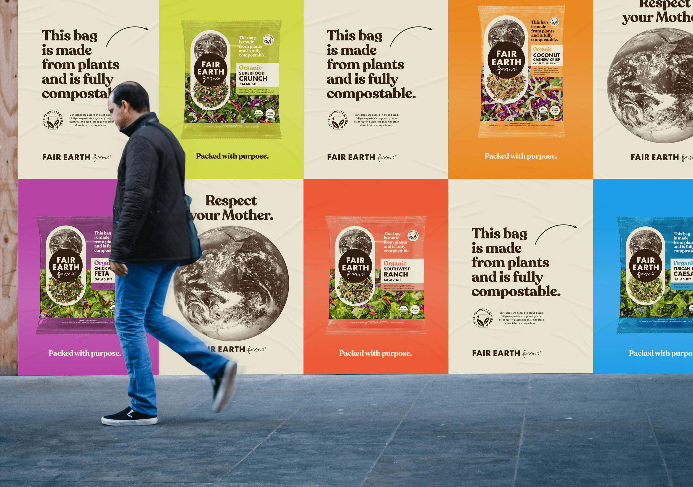
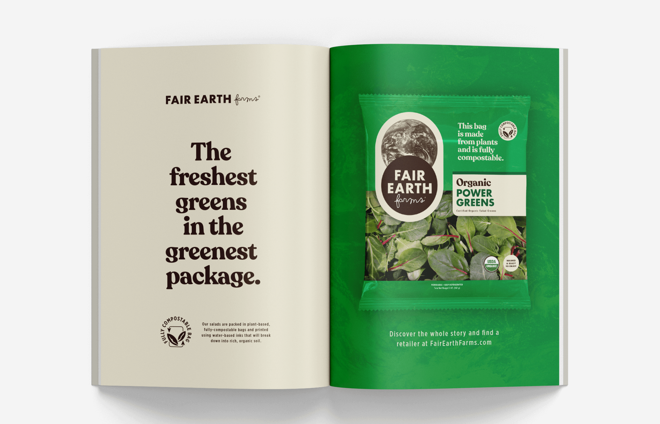
Fair Earth Farms is empowering the consumer to not only make a different choice in the produce aisle, but to re-consider the packaging of our everyday greens entirely.

Get the quarterly newsletter
CONTACT US | OUR STORE | INSTAGRAM
hello@superiorbranding.co
©2022 Superior Branding Enterprises, Inc.

